- By Adam Koós, CMT, CFP®, CEPA Investopedia is partnering with CMT Association on this newsletter
- The contents of this newsletter are for informational and educational purposes only, however, and do […]
Investopedia is partnering with CMT Association on this newsletter. The contents of this newsletter are for informational and educational purposes only, however, and do not constitute investing advice. The guest authors, which may sell research to investors, and may trade or hold positions in securities mentioned herein do not represent the views of CMT Association or Investopedia. Please consult a financial advisor for investment recommendations and services
We’ve talked about the government shutdown this week, we’ve gotten into whether the market is healthy or not, and we even compared sectors and asset classes against one another to determine the strongest candidates in the market today.
If you missed any of these previous installments of Chart Advisor, you can find them here:
- Monday: Government Shutdowns and Market Health
- Tuesday: Digging Deeper into the Health of the Stock Market
- Wednesday: More “Healthy” Evidence and Emerging Stocks
- Thursday: Finding Strength and Comparing Sectors
I promised yesterday that we’d drill down a little more and look at both the bond market and some individual stocks, so let’s start with bonds.
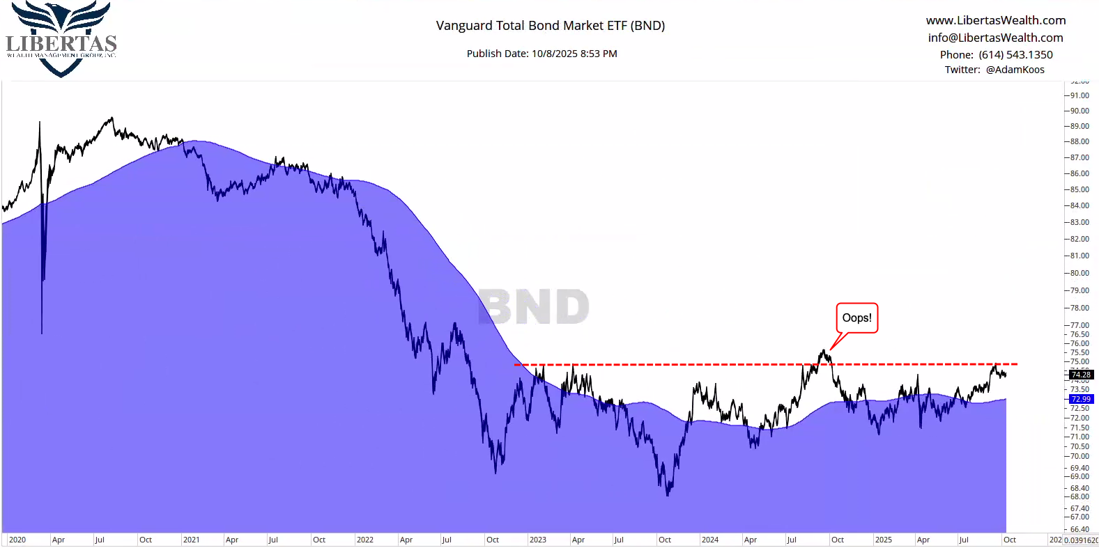
Bonds have had a rough time since COVID, largely due to the fact that rates were hiked so far and so fast. When rates go up, bond values sink, and as you can see in the chart below, “sink” …they did.
In this example, the Vanguard Total Bond Market ETF (BND) fell by roughly -25% from top to bottom. Not exactly the “safe” investments grandma and grandpa told you about, huh?
That being said, as the Fed has initiated its first interest rate cut, bonds are finally starting to show some promise this year, and in the chart below, you can see that there is a potential ceiling of overhead resistance going back to the early-2023 highs that this particular basket of bonds has yet to contend with.

But… not everything sucks in the bond market.
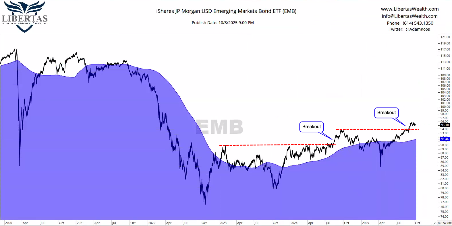
Emerging markets bonds, with the tailwind of a falling US Dollar have broken out not once, but twice, all within the context of an overall, long-term uptrend.
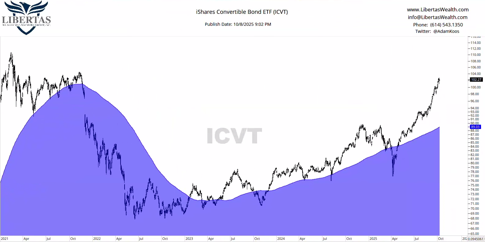
…and okay, maybe it’s “cheating” to use convertible bonds as a “bond proxy” at all (since they convert to common stock), but if you check out the chart below, the iShares Convertible Bond ETF (ICVT) doesn’t look so bad at all.
Just remember bond sectors like this one do have a higher correlation to the stock market, or said another way, “they don’t act like your stereotypical bond investment.”
Alright, baby birds… don’t worry, your stocks are coming, but I already showed you a rate-of-change ranking list of ETFs, as well as a Relative Rotation Graph (RRG) full of stocks that look in a prime place to improve vs. the overall market, so I feel like I need to go off the reservation here vs. revisiting something you’ve already seen.
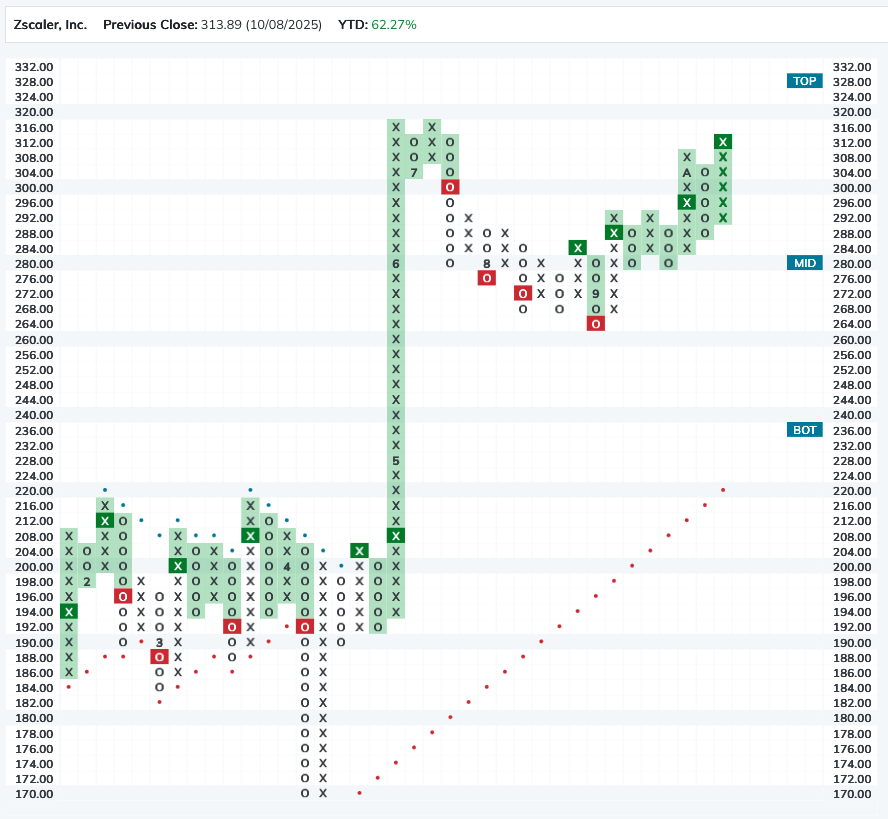
So, let’s go crazy here and wrap this week up in the world of Point & Figure (PnF) charts – a charting method that’s kinda like playing tic-tac-toe with the stock market. X’s mean prices are going up, and O’s mean prices are going down.
My favorite part of these charts is that they completely remove time from the equation, so the only time you see an X get placed at a higher price is if that price moves to the next dollar amount in question (say, from $100 to $102 per share), and the only time it falls and another O is placed on the chart is if it falls to a lower dollar amount, based on the price of the investment in question (let’s say, from $50 to $49 per share)
Here’s a PnF chart of Zscaler (ZS) below, using what’s called a three-box reversal method, which simply means that, if the chart is going up (in X’s), the only way it can reverse down is if the price moves down by three boxes.
Finally, any time there’s a higher X than the previous row of X’s, it’s considered a “buy signal.” That doesn’t mean you should necessarily buy the stock, by the way – because similarly speaking, whenever there’s an O lower than a previous row of O’s, it’s called a “sell signal,” but again – just because you get one sell signal doesn’t mean you go hit the <sell button>. 🙂
Nerd’s Note: You’ll notice that the price scale and dollars-per-box change as the stock rises higher. So between $100 – 200/sh, it’s $2 per box – but since rising above $200/sh, each box is worth $4. The reason for this is because the percentage movement of the stock changes as the price-per-share gets larger.
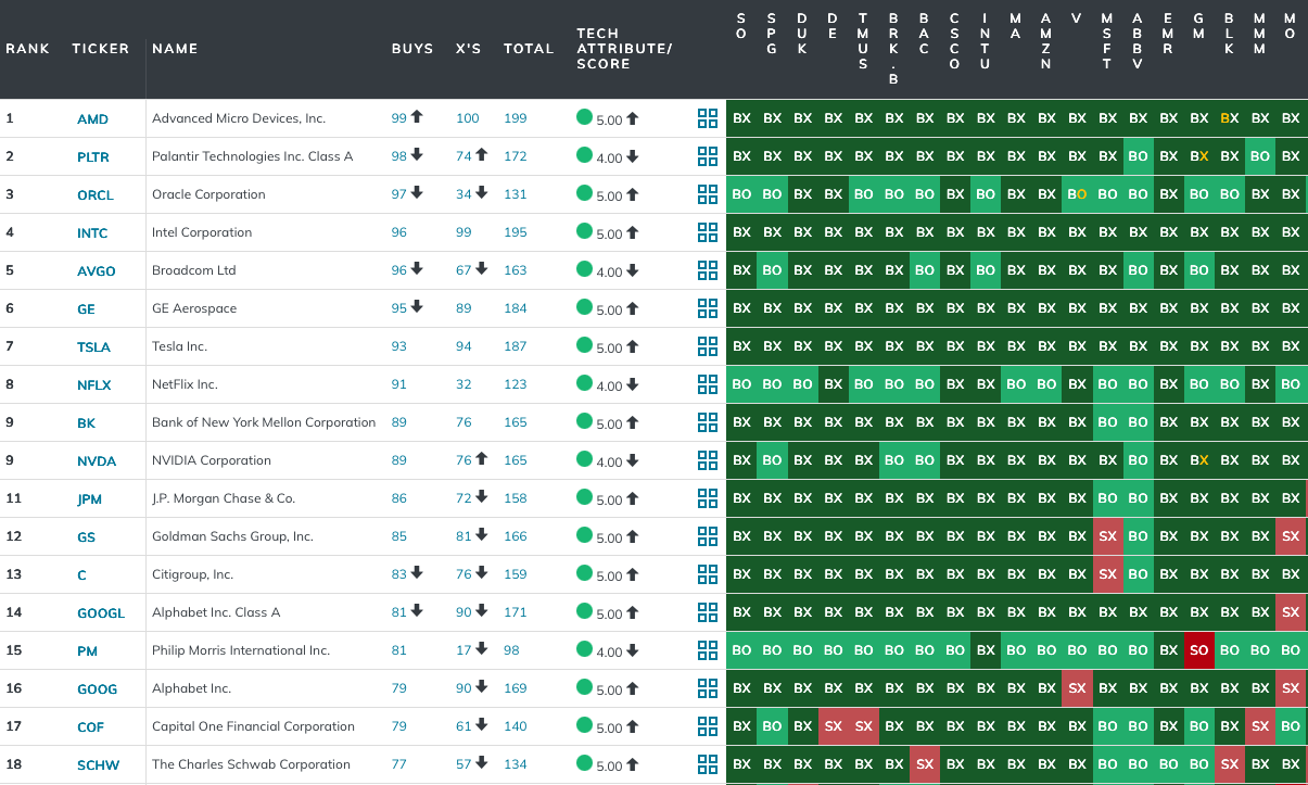
Now that you loosely understand PnF charts, another really cool thing you can do with them is create ranking matrices using charts that exclude time from the analysis. This way, you’re only using price movement and relative strength, without the “noise” of time getting in the way.
Now, I’m warning you… this can get a little messy, but don’t let the craziness of the ranking table below scare you away from PnF matrices, let alone the charts we use to build them!
So, what I did below was pull up all the PnF charts in the NASDAQ 100 in the form of a matrix, and what you’re looking at is the top-18 stocks in a relative strength comparison between all the stocks in the index.
Think of it this way, each stock is “playing” every other stock in the index in one, big round-robin tournament on a daily basis. So, everyone is playing everyone, and whoever ends up with the most wins (i.e. “buy signals”) gets the #1 ranking… the second-highest winning stock gets the #2 spot and so on.
And again, remember, these charts exclude time, so the only way you’ll see a change in leadership is if one stock goes up vs. another. That’s it!
Nerd’s Note: You can’t see them all, but if you look at AMD at the #1 spot and then scan to the right, you can see the start of the “round robin tournament” I was referring to above. So when you look at the first stock it was compared to (SO), it’s in a buy signal and improving (in X’s) vs. that stock, hence the plot in that first box reads “BX.” If you keep going, you’ll see that AMD is pretty strong right now, so it’s not even weakening vs. any of those first handful of positions. But if you look at Palentire (PLTR) in the #2 spot, if you scan about two-thirds of the way to the right, you’ll see that vs. Abbvie (ABBV), it’s on a buy signal, but weakening vs. ABBV, hence the plot in that box reads “BO.”
Alright, that’s enough for me this time around. It’s always a pleasure being asked to write for Investopedia and the CMT Association.
I hope you enjoyed this week’s issues, and feel free to reach out to me personally with any questions at all. This stuff isn’t “work” to me. In fact, I always say “I haven’t worked in 24 years!”

Adam Koós, CFP®, CMT, CEPA is a CERTIFIED FINANCIAL PLANNER™, one of approximately 2,500 active Chartered Market Technicians (CMT) worldwide, as well as a Certified Financial Technician (CFTe®) through the International Federation of Technical Analysts (IFTA), and a Certified Exit Planning Advisor (CEPA) via the Exit Planning Institute. Adam serves his clients as the president and portfolio manager at Libertas Wealth Management Group, Inc, a NAPFA-affiliated, Fee-Only Fiduciary and Registered Investment Advisory (RIA) firm, located in Columbus, Ohio. To reach out to Adam Koós email [email protected].

Shared content and posted charts are intended to be used for informational and educational purposes only. CMT Association does not offer, and this information shall not be understood or construed as, financial advice or investment recommendations. The information provided is not a substitute for advice from an investment professional. CMT Association does not accept liability for any financial loss or damage our audience may incur.