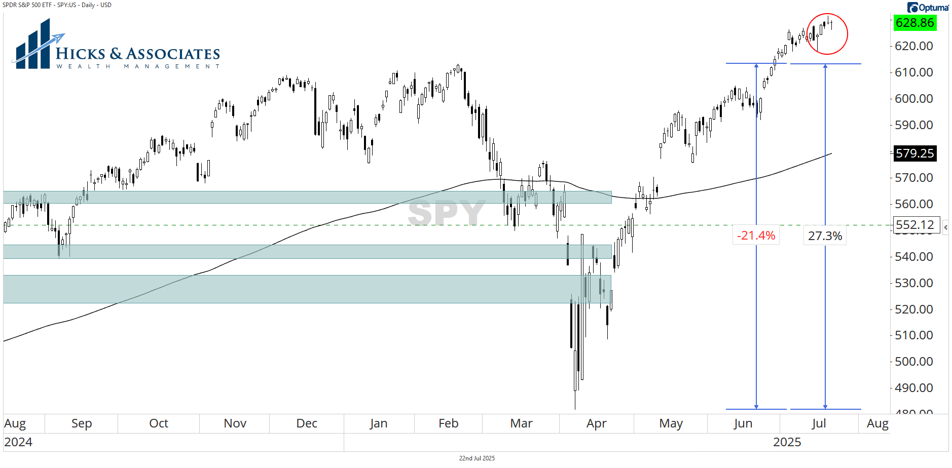
1/ Doji on SPY & Portfolio Math
Our first chart today is of SPY, one of the ETFs that tracks the S&P 500. The first thing I want to point out is that doji candle representing yesterday’s action. The good news is that SPY was able to close back at the open even after trading down most of the day. But a doji candle is one that represents indecision. We will come back to that in just a minute.
But before we go on, Chart 1 also illustrates what we call Portfolio Math. I cover this in much greater depth in my book, Evidence-Based Investing. Notice the two price measurements. While they are approximations, notice that the S&P 500 dropped ~21%. But, in order to get back to break even, it had to rally 27%. This is an example of Portfolio Math. Losses work geometrically against you. The larger they are, the harder they are to recover from. That should influence your strategy.
2/ Participation Broadening Out?
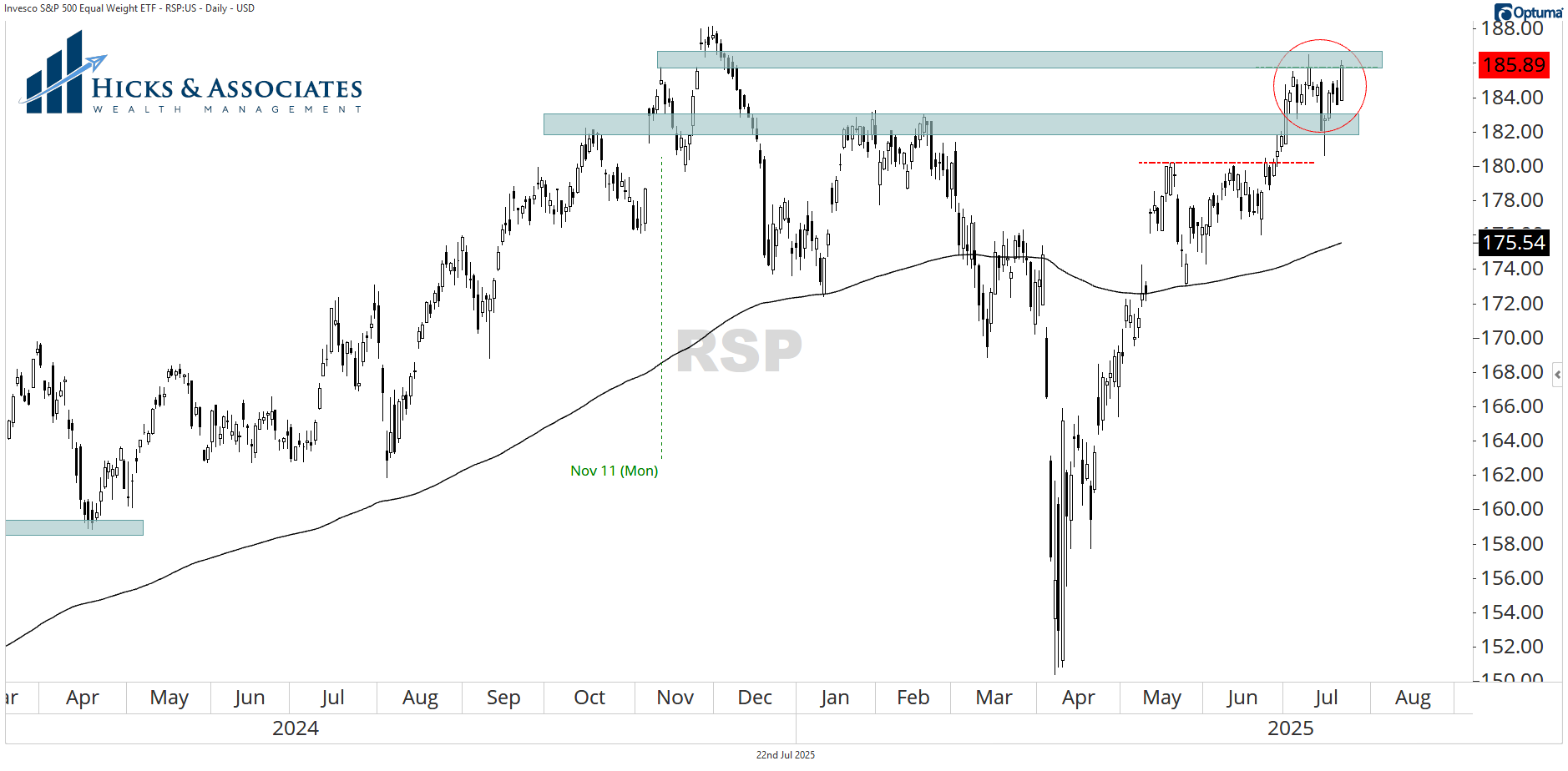
Chart 2 today is for RSP. This is the Invesco Equal-Weight S&P 500 ETF. Here we see a different story. This story has a bit more conviction. Here we see that RSP opened lower on the day but had a strong rally and, perhaps more importantly, closed near the day’s highs. This gives us a clue that perhaps the market is broadening out a bit. Perhaps more stocks are beginning to participate in this rally? If that’s true, then the bull-market has legs. If that is NOT true, then this bull market will be short-lived.
The lower blue-gray bar represents resistance. The good news is that RSP has broken above that level and has survived a recent test of that level. Inside the red circle, I’m highlighting the fact that this mini-consolidation area represents a moment of truth. Notice how yesterday’s close was right at the highs of this mini-consolidation area plus it represents the bottom of that gap higher from November 11th. If RSP can convincingly move above this consolidation area, it signals a strong chance that RSP will also be making new highs.
That has broad implications.
3/ Not As Much As I’d Like
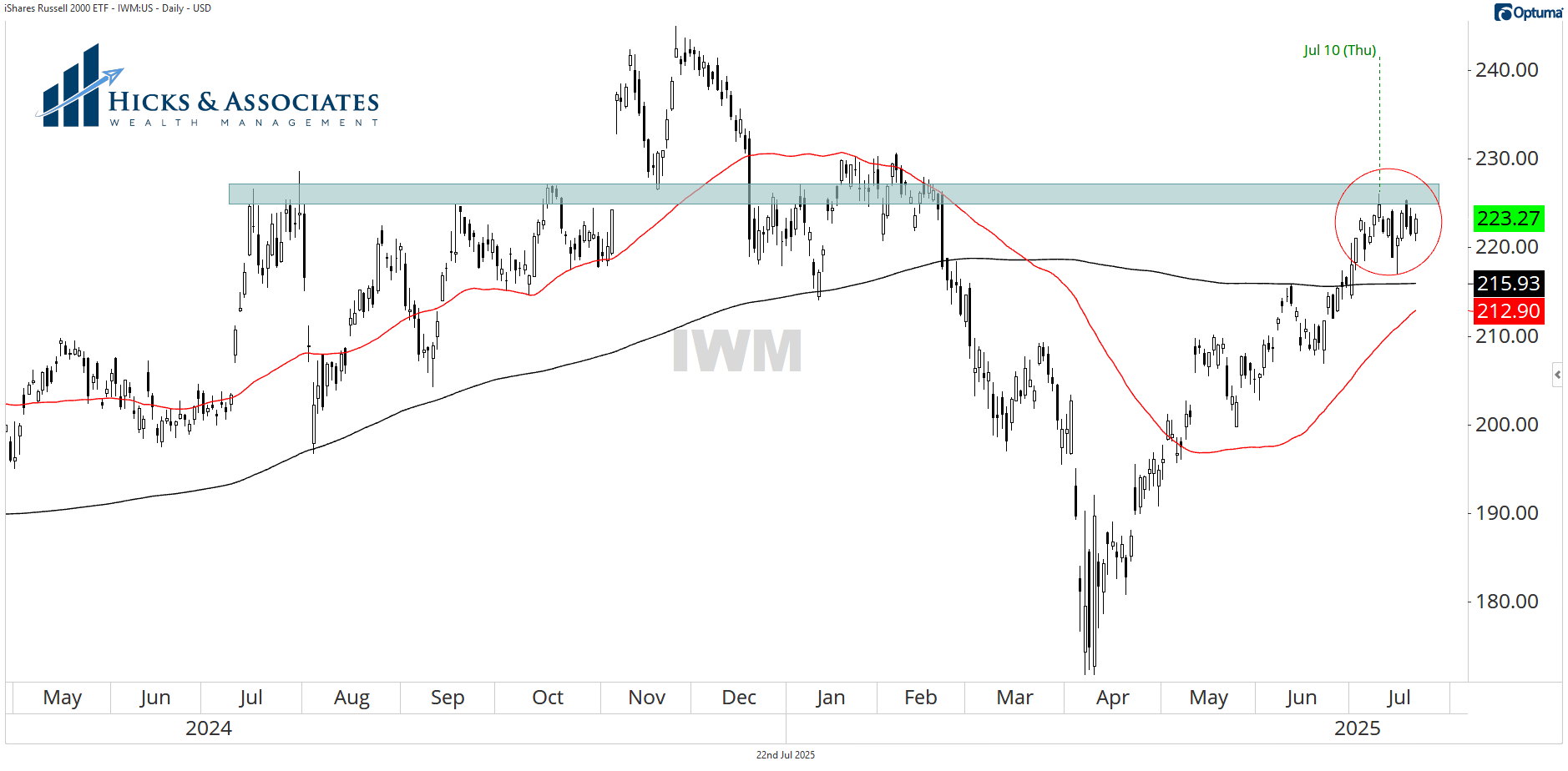
Here we see a problem. Our third chart today is of IWM, the Russell 2000 ETF which is broadly considered the best measure for the small-company universe here in the United States. Here we see that the current area of consolidation does have some more baggage to overcome. These levels are the highs from July 2024. This area has been a really challenging zone for the small company index. While I’m not showing it here, I could zoom out even further and show you that this is about the same level as the highs from 2021.
We should not be surprised if small companies really struggle to truly break free.
4/ On Balance Volume Is Encouraging
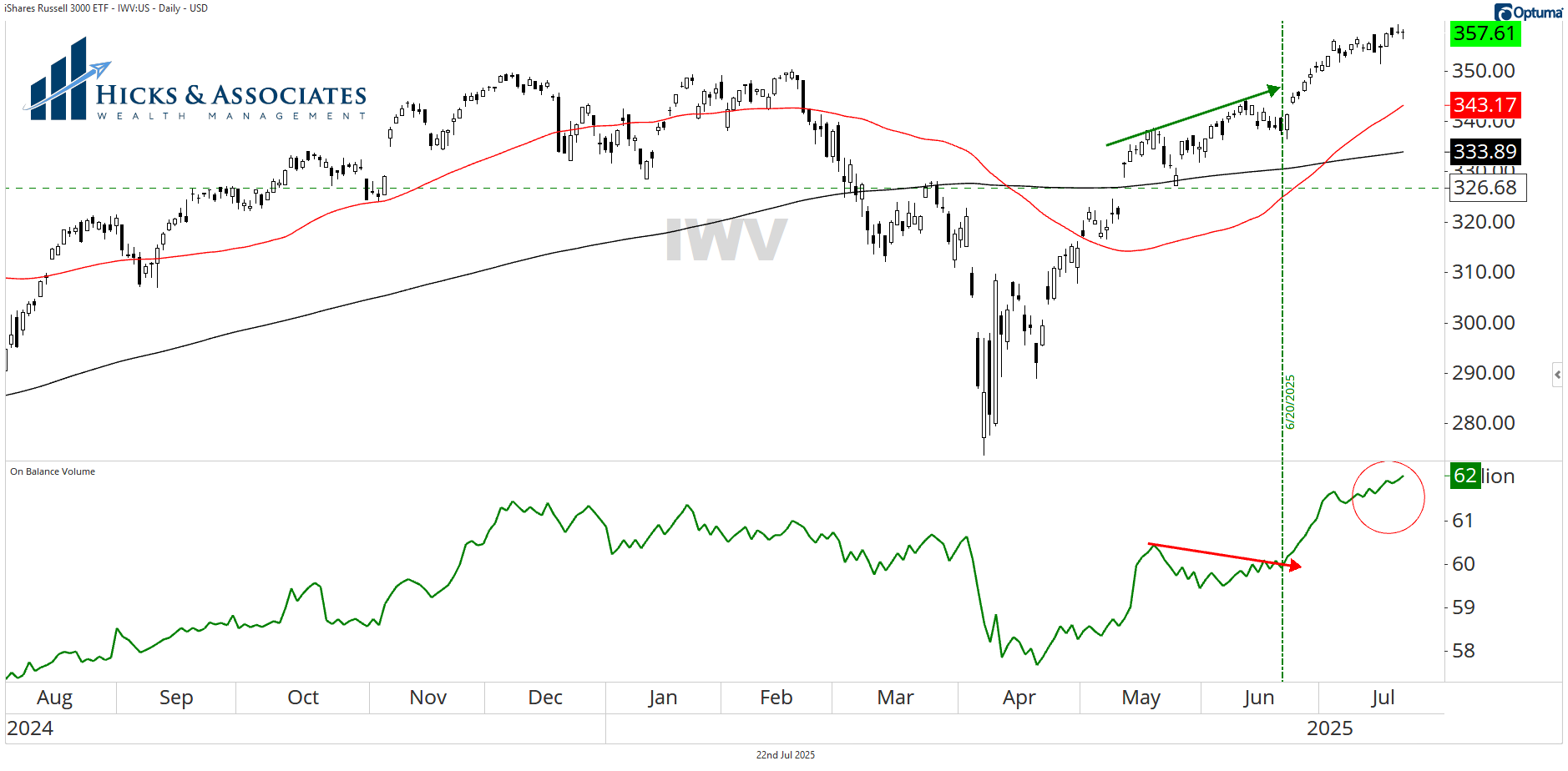
If you are not familiar with On Balance Volume, take a look at this article from Investopedia. Our fourth chart today shows the Russell 3000 in the top pane and On Balance Volume in the bottom pane. While the Russell 2000 captures the small-cap universe pretty well, I use the Russell 3000 to examine the entire US stock market as it captures about 95% of the US stocks.
In short, the fact that On Balance Volume is making a new high while price did not make a new high, that’s an encouraging sign. No guarantees of course, but I like what this indicator is telling me.
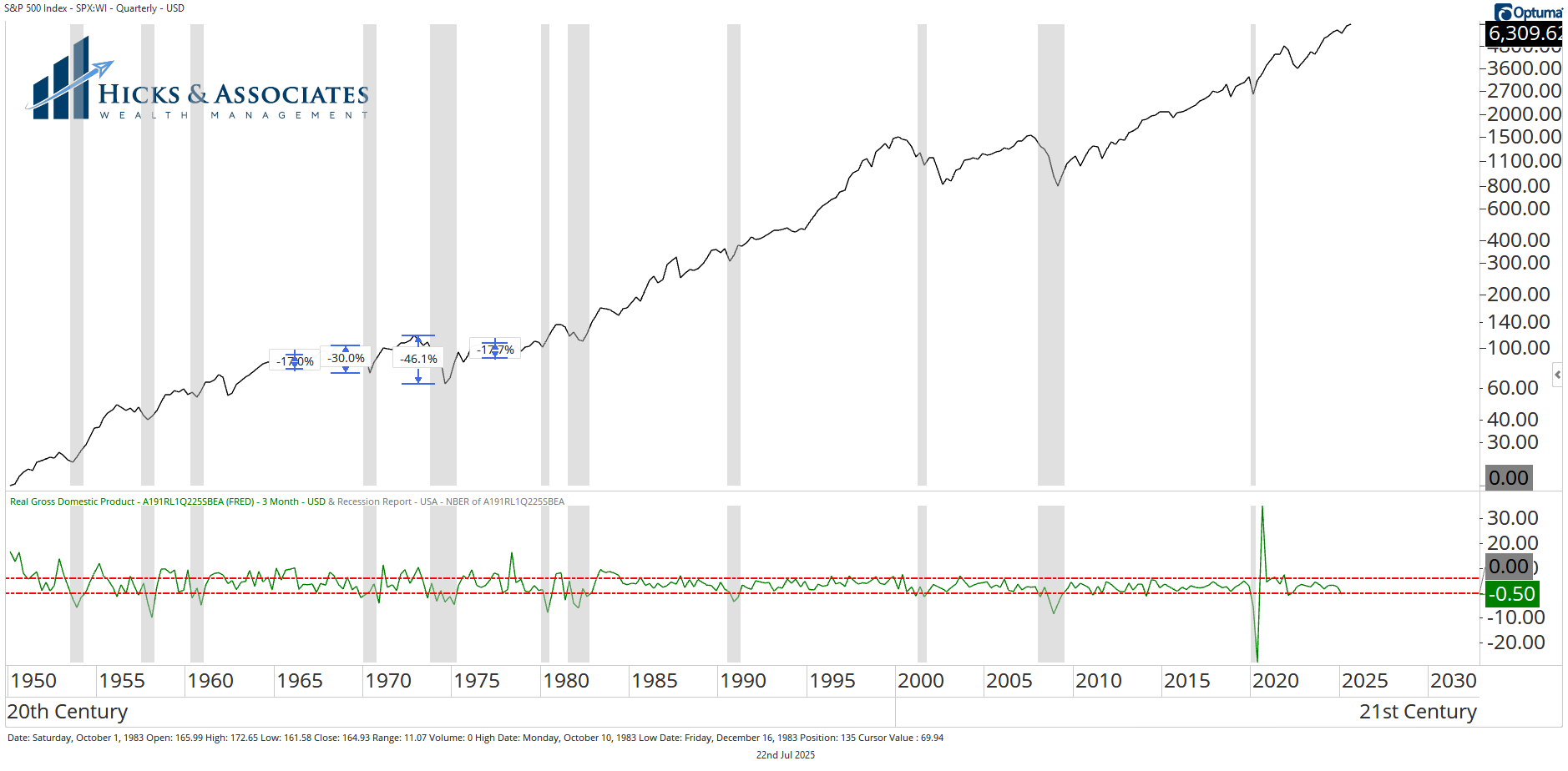
5/ Finally, Goldilocks
In yesterday’s newsletter, I used the term “Goldilocks Economy”. While most would like to see the economy grow at a faster rate, what we really want is an economy that is neither too hot nor too cold.
In this final chart, I’m showing the S&P 500 index dating back to its creation. The bottom pane is showing the nation’s GDP. Ultimately, when our economy is growing at a rate between those two red lines (-0.5 – +2.0), our stock market has a tendency to do well. If we grow much faster or decline much further, that’s when we see big stock market shocks. We don’t want those.
Shared content and posted charts are intended to be used for informational and educational purposes only. CMT Association does not offer, and this information shall not be understood or construed as, financial advice or investment recommendations. The information provided is not a substitute for advice from an investment professional. CMT Association does not accept liability for any financial loss or damage our audience may incur.
