1/ Momentum Index Makes Investing Look Easy!
Over the last 3yrs, the S&P 500 Momentum Index has outperformed the S&P 500 by nearly 2x. The index selects 100 stocks in the S&P 500 with the strongest risk-adjusted momentum over the past 12 months—excluding the most recent month to avoid short-term reversal bias. The index rebalances twice a year, and weights holdings based on both momentum scores and market cap, with sector caps in place to keep things diversified. It’s designed to track the persistence of strong price trends across large-cap U.S. stocks.
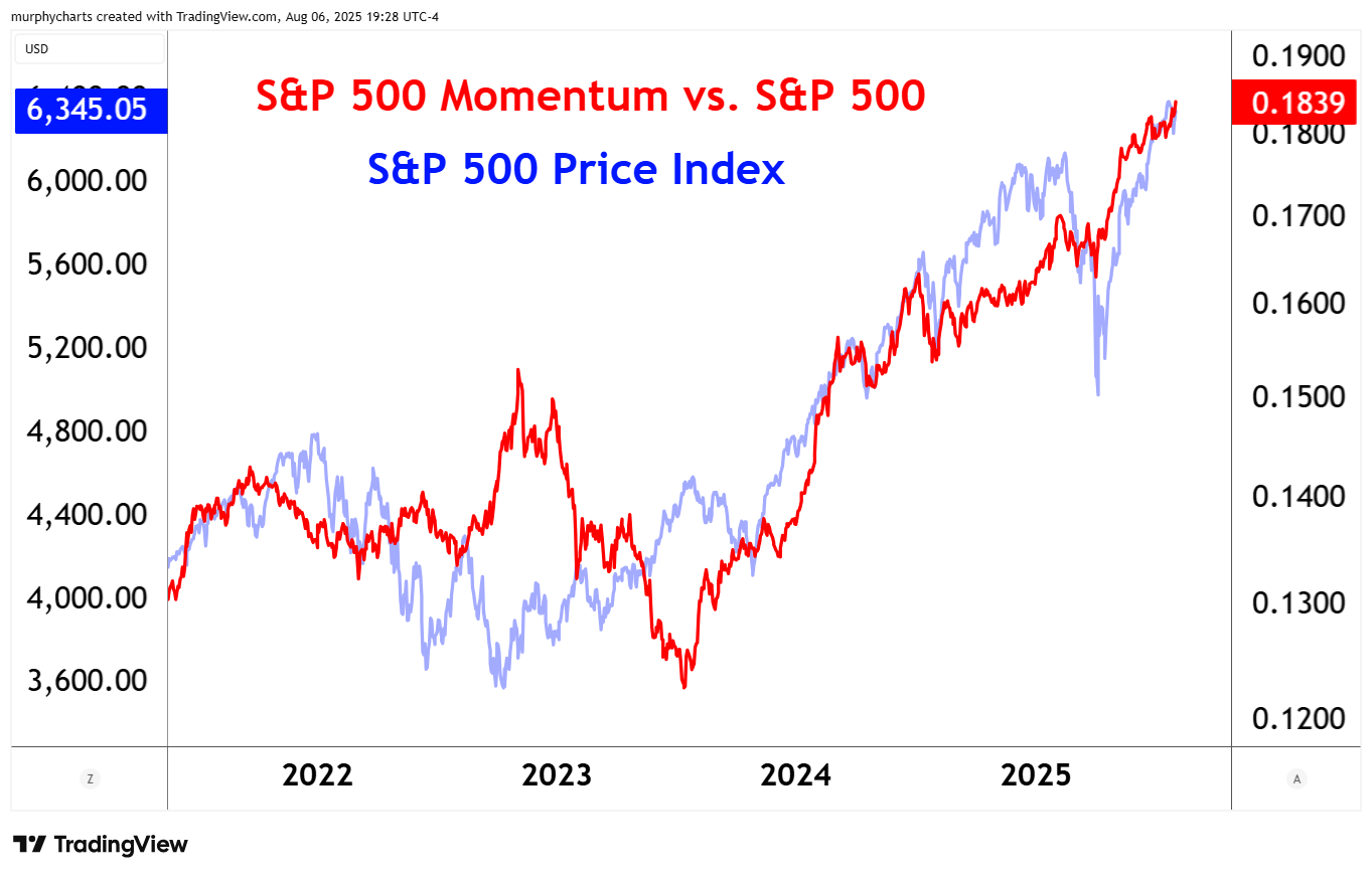
This week, the index achieved yet another all-time closing high. The S&P 500 Index is one tough denominator – yet this momentum index has consistently outperformed and is displaying no sign of letting up!
2/ Healthcare – Inverted Scale
The Healthcare sector has been out of favor for quite some time. Underperforming even cash assets over the trailing 3yrs. When price has reached an extreme in either direction, I find it valuable to invert the price scale and re-evaluate.
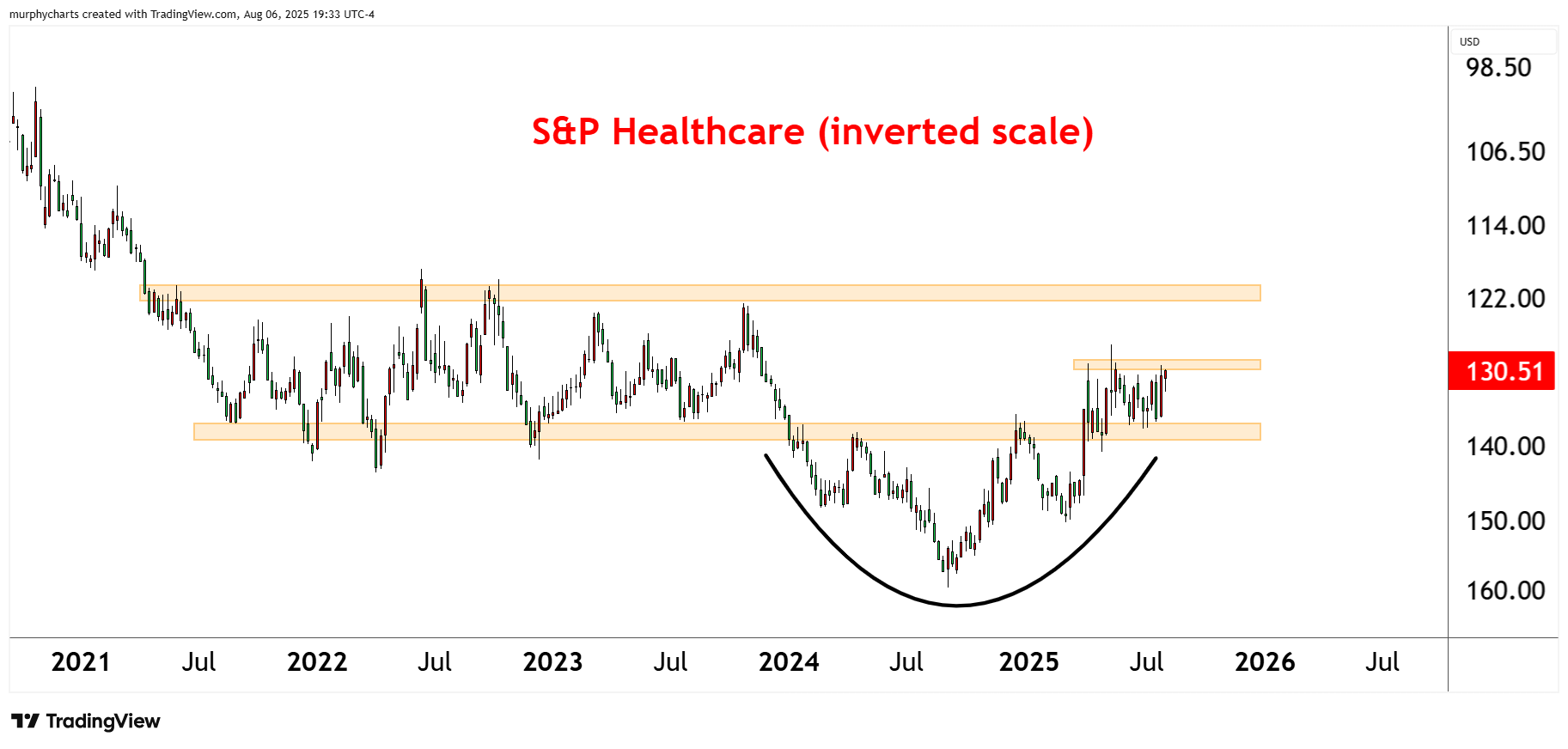
I’ll ask myself the same question I always do when analyzing stock prices, “Do I want to own or sell this asset.” When inverted, the chart formed a bullish accumulation pattern for all of 2024 – finally breaking out in April 2025. Now, price sits atop a well-defined support/resistance zone and continues to bump its head on $130/share. All this information supports a bullish view of the asset. It may seem frivolous but as a technician, this simple exercise helps keep my biases in check.
3/ Clean Energy – Trend Change Attempt
Clean Energy is an industry group held captive in a downtrend for nearly 5-years. Price is now finally trading above an upward sloping 200-day average – however a trend change is yet to officially occur. For the asset to change trend, we must see higher highs and higher lows. The index is struggling to breakout above a well-tested support/resistance zone. A zone that also marks the 2020 COVID lows.
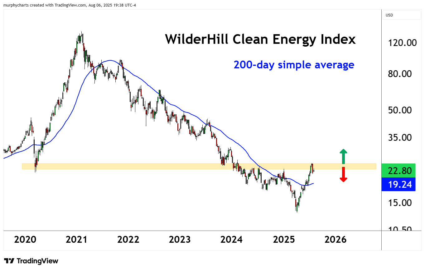
This chart is a good example of when to apply simple if-then statements to your investing process. For example, if price is > X then we own the asset. If price is < X then we sell the asset. Simple, but extremely effective!
Shared content and posted charts are intended to be used for informational and educational purposes only. CMT Association does not offer, and this information shall not be understood or construed as, financial advice or investment recommendations. The information provided is not a substitute for advice from an investment professional. CMT Association does not accept liability for any financial loss or damage our audience may incur.
