Investopedia is partnering with CMT Association on this newsletter. The contents of this newsletter are for informational and educational purposes only, however, and do not constitute investing advice. The guest authors, which may sell research to investors, and may trade or hold positions in securities mentioned herein do not represent the views of CMT Association or Investopedia. Please consult a financial advisor for investment recommendations and services
S&P 500 New High Signals Green Light for Stocks
The S&P 500 index has started 2026 in a position of strength, with the key US equity benchmark achieving new all-time highs again this week. An uptrend is created by a pattern of higher highs and higher lows, and the SPX has established this pattern off the November 2025 swing low.
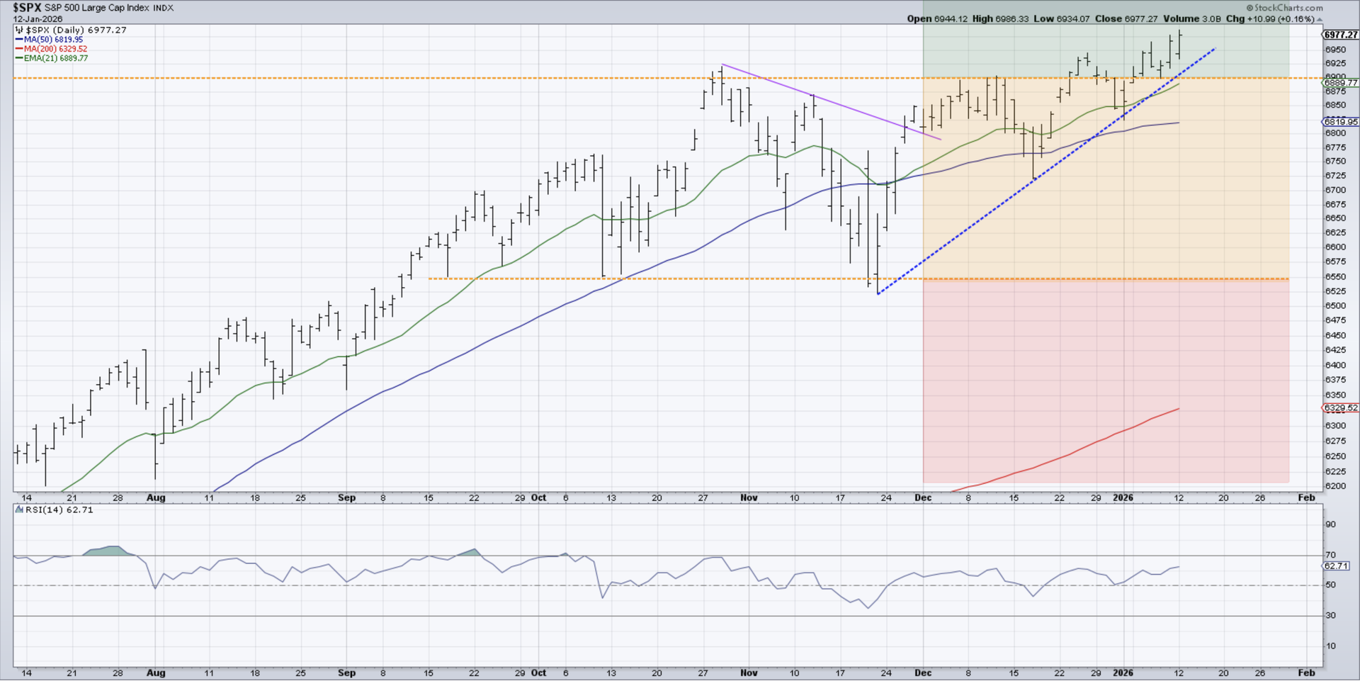
When a chart settles into a consolidation pattern, we’ve found a “traffic light” technique can provide a clear visual representation of how to interpret future price breaks. In this case, we can use the October and November highs around 6900 as resistance, and the October and November swing lows for support around 6550.
If the price would break below support at 6550, the S&P would move into the “red light” section as the price was now making a pattern of lower lows. A confirmed move above 6900, as we’ve noted in early January, confirms instead a transition into the “green light” area. With higher highs and higher lows confirmed, and as long as the S&P 500 remains above a trendline formed from the November and December swing lows, we would consider this chart to be “innocent until proven guilty.”
New Dow Theory Confirms Broad Advance
Charles Dow’s classic comparison of the Dow Industrials and Dow Railroads allowed him to gauge the strength of the US economy by confirming the patterns in the producers of goods as well as the distributors of goods. If both indexes were achieving new highs, then this meant a bullish outlook for US stocks based on the broad advance.
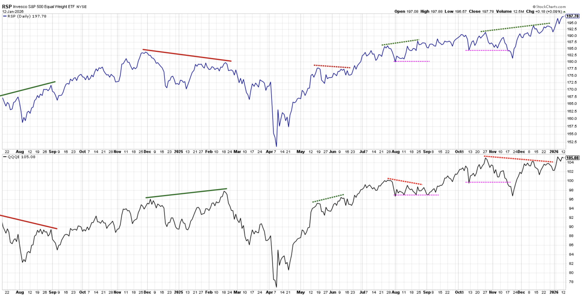
A more modern version of Dow’s Theory is shown here, using the equal-weighted S&P 500 and equal-weighted Nasdaq 100 ETFs. These two indexes represent the “old economy” and “new economy” names, respectively. A divergence between these two ETFs often occurs before a major market top, as one side of the economy does not confirm the strength of the other.
We noted a bearish non-confirmation in December, as the equal-weighted S&P 500 pushed to a new all-time high which was not confirmed by the equal-weighted Nasdaq 100. As December transitioned to January, that bearish divergence has appeared to be alleviated. Even though a number of the Magnificent 7 names have been struggling, a breakout in both of these indexes would imply that the major equity indexes can indeed push higher without the support of key large cap growth stocks.
Coil Pattern Confirms Neutral Posture for Palantir
While stocks like Apple Inc. (AAPL) and Meta Platforms (META) have experienced recent breakdowns in price, the chart of Palantir Technologies (PLTR) appears to be in a clear symmetrical triangle or “coil” pattern. With lower highs and higher lows over the last ten weeks, the stock has been settling in around a center price of around $185.
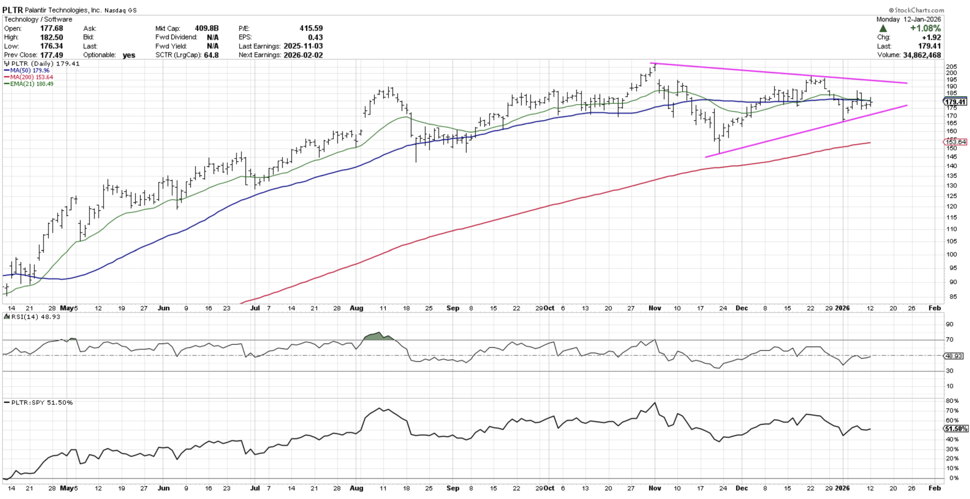
A chart can be in one of three phases at any point: an uptrend phase of higher highs and higher lows, a downtrend phase of lower highs and lower lows, or a consolidation phase of lower highs and higher lows. This sideways pattern on the chart of PLTR means that the market has reached an equilibrium created by a balance of buying power and selling pressure.
At some point the price of Palantir will either break above the upper trendline or below the lower trendline. Until that breakout occurs, the chart is suggesting we “sit on our hands” and wait for the price to tell us whether buyers or sellers are taking control!

David Keller, CMT is a past president of the CMT Association, a CNBC Contributor, and President and Chief Strategist at Sierra Alpha Research. Dave recaps market activity and interviews leading experts on his “Market Misbehavior” YouTube channel. He has served as Managing Director of Research at Fidelity Investments, Chief Market Strategist at StockCharts, and Application Specialist at Bloomberg.
Shared content and posted charts are intended to be used for informational and educational purposes only. CMT Association does not offer, and this information shall not be understood or construed as, financial advice or investment recommendations. The information provided is not a substitute for advice from an investment professional. CMT Association does not accept liability for any financial loss or damage our audience may incur.
