- In installments 1 – 3 we discussed building a market momentum matrix to help anticipate the business cycle
- In this installment we introduce the OECD Composite Leading Indicator and plot the information derived from the momentum matrix onto a stylized business cycle
- In the final installment we will make observations and share thoughts around the current cycle
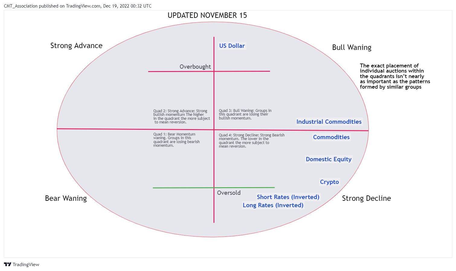
- As a reminder, this is the distilled version of the momentum matrix built in the first 3 installments
- Before I plot the distilled sectors onto a stylized business/market cycle overlay, I plot equities, rates and commodities onto an overlay with the Organization for Economic Co-operation and Development (OECD) Composite Leading Indicator ( CLI ) for the United States
- Readings above 100 (dashed red line) suggest economic expansion to come while below […]
In installments 1 – 3 we discussed building a market momentum matrix to help anticipate the business cycle. In this installment we introduce the OECD Composite Leading Indicator and plot the information derived from the momentum matrix onto a stylized business cycle. In the final installment we will make observations and share thoughts around the current cycle.
As a reminder, this is the distilled version of the momentum matrix built in the first 3 installments.
Before I plot the distilled sectors onto a stylized business/market cycle overlay, I plot equities, rates and commodities onto an overlay with the Organization for Economic Co-operation and Development (OECD) Composite Leading Indicator ( CLI ) for the United States. Readings above 100 (dashed red line) suggest economic expansion to come while below the 100 line suggests weakness, and perhaps recession to come. The index is currently below 100 and falling, consistent with future weakness.
To help visualize the cycle, I plot 10 year rates (inverted), SPX and the Thompson Core CRB index along with the CLI . Viewed in the manner the current cycle appears to be consistent with past cycles in terms of sequencing. Rates top, economy ( CLI ) tops, equities top, commodities top and finally CLI enters the contraction phase.

Finally, the distilled sectors are placed onto stylized market and economic cycle sine curves. If markets (dark blue curve) are correctly anticipating the business cycle (grey curve) the business cycle is somewhere past peak, and should be expected to steadily deteriorate over coming quarters.

In part 5 we will draw conclusions.
And finally, many of the topics and techniques discussed in this post are part of the CMT Associations Chartered Market Technician’s curriculum.
Good Trading:
Stewart Taylor, CMT
Chartered Market Technician
Taylor Financial Communications
Shared content and posted charts are intended to be used for informational and educational purposes only. CMT Association does not offer, and this information shall not be understood or construed as, financial advice or investment recommendations. The information provided is not a substitute for advice from an investment professional. CMT Association does not accept liability for any financial loss or damage our audience may incur.
